Your Cart is Empty
SAVE TIME, ORDER ONLINE FOR IN-STORE PICK UP
- Shop
- Shop Supplies
- Shop Color
- Window Treatments
- About Us
- For Professionals
- Festool
- Contact Us
- Store Locator
- Gift Cards
- Find a Painter
- Blog
- Login

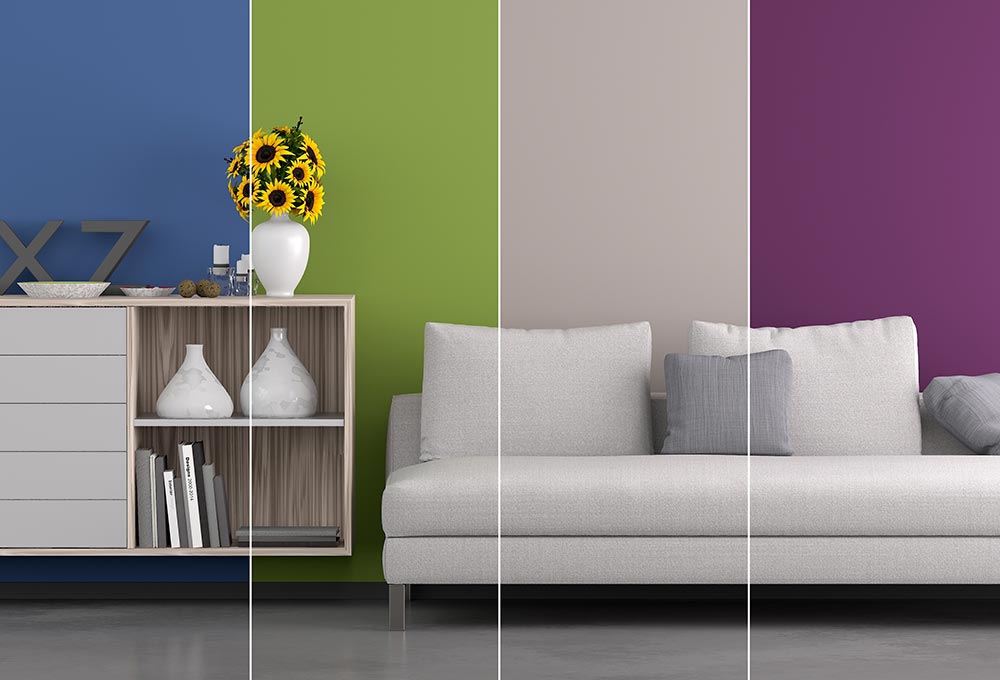
Whether you have spent hours of time searching for the right shade or easily picked your favorite, the color of a room has a serious affect on your mood. While colors affect people differently (based on their age, gender, climate, etc.), research has shown that certain colors tend to get a similar reaction from all types of people. Before you begin your painting project, think about the mood you want certain rooms in your home to give off. Use our tips below to help you achieve a harmonious and beautiful home!
Using Red in Your Home
Red is an exciting and stimulating color. Because of its ability to pump up your adrenaline, it is great for rooms that you want to promote conversation in, such as the living room or dining room. Because it is known to increase your pulse, heart rate, and blood pressure, it is not recommended to use in the bedroom. You want a calming color in your bedroom, and red is the opposite of that. Another great option to incorporate red into your home is to use it in your front entryway. It will be a strong first impression to your houseguests!
How to Incorporate Yellow in Your Interior
It’s no surprise that the color yellow communicates happiness. With its energizing and uplifting qualities, it is best to use yellow in your kitchen and bathroom. However, use this color as an accent, rather than the main color scheme. Studies show that people are more likely to lose their temper in a room with yellow interior.
Calming Blues for Your Space
A light blue color scheme in your home can make you feel more relaxed, calm and serene. While red increases your blood pressure and heart rate, blue does the opposite. That’s why it’s recommended to use light shades of blue in bedrooms and offices. Be sure to not use darker shades of blue as the main color in a room, as darker shades evoke feelings of sadness.
Green is a Great Color for Any Room in Your Home
Known as the most restful color for your eyes, green is the perfect color for any room in your home. This color is a powerful stress reliever. Adding green into any space encourages unwinding but has enough warmth to promote comfort and togetherness. It is believed that the color green evokes feelings of tranquility and composure because of the abundance of green shades found in nature.
Using a Dramatic Color Like Purple in Your Space
Rich, dramatic, and sophisticated, purple can help give a color scheme depth. The affect of purple on your mood depends on what shade you choose. Darker shades of purple are long known for being associated with luxury and creativity. Lighter shades of purple, however, bring about the same restful quality that blue does without making the room feel chilly. We recommend adding Benjamin Moore’s 2017 color of the year, Shadow, into your home! This deep, saturated shade of purple is a sophisticated way to make a bold statement.
Use Orange in Rooms to Boost Energy
Do you have an in home gym? Use orange to help you get the most out of your workout! This energetic color evokes excitement and enthusiasm. By incorporating orange into the gym area of your home will help you release any emotions during your exercise routine. Ancient cultures believed that the color orange helped heal your lungs and increase energy levels. Because of its energizing qualities, stay away from adding orange into your living room or bedroom.
Neutral Colors are Perfect to Pair with Other Colors
Not only are neutral colors timeless, but they also are extremely flexible. With their ability to match every color, it’s great to include neutral colors into your color scheme. Using black as an accent can help ground your color scheme and bring drama into your space. White can help make a space feel airy and open.
Paint Stores in Pennsylvania
Now that you have advice from the experts, it’s time for you to get to work! With our three convenient locations in Mount Pocono, Scranton, and Easton, Gleco Paints is the ultimate paint destination in Pennsylvania. We offer top interior and exterior paint brands, including Benjamin Moore, Coronado, and Pittsburgh Paint, as well as wood stains, equipment, and decorating services. For more information on how we can help you with your next home project, be sure to contact us today.

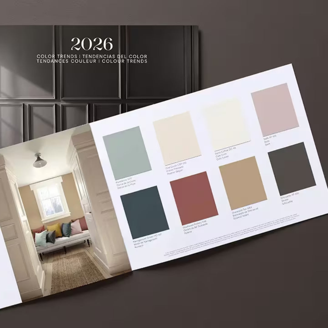
Find fresh color inspiration for 2026 with Benjamin Moore’s new Color of the Year and Color Trends Palette. Silhouette is a study in balance — rich yet restrained, moody yet inviting.

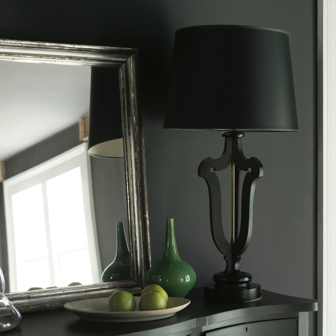
Black paint adds contrast, depth, and timeless elegance to Pennsylvania homes. It pairs beautifully with neutral shades, metallic finishes, and natural textures, allowing homeowners to craft spaces that feel both dramatic and sophisticated.

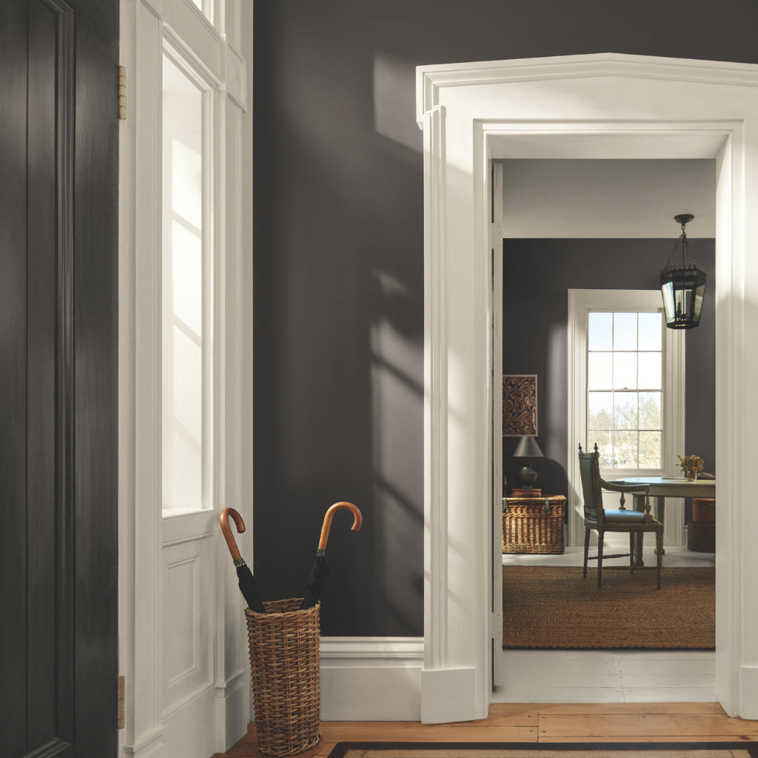
Gray paint colors adapt beautifully to natural light, making them ideal for homes in Easton, Scranton, and Mt. Pocono.