Your Cart is Empty
SAVE TIME, ORDER ONLINE FOR IN-STORE PICK UP
- Shop
- Shop Supplies
- Shop Color
- Window Treatments
- About Us
- For Professionals
- Festool
- Contact Us
- Store Locator
- Gift Cards
- Find a Painter
- Blog
- Login
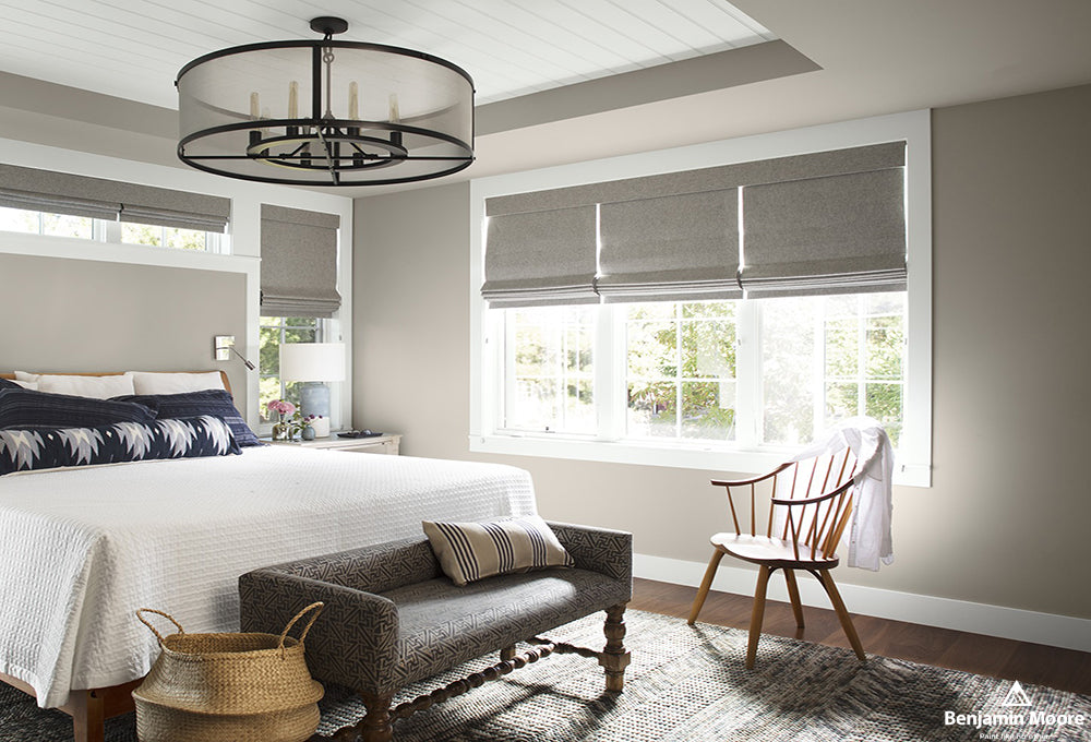
When it comes to serenity in your sleeping quarters, we’ll lay it down: the bedroom is meant to be a dreamy oasis; a calming and comfortable retreat; a relaxation station designed especially for you to unplug and power down.
Color is the best way to create some seriously soothing ambiance in the boudoir. “It’s not just plush pillows and cozy throws that create a tranquil environment; wall color can have a big impact on the overall feel of the room,” said Benjamin Moore color and design expert Hannah Yeo recently.
The pros also know that cooler hues feel right at home in spaces where you most want to chill out. These colors promote relaxation, reduce stress and anxiety, slow heart rate and improve sleep quality. And isn’t that exactly what we’re going for in the place we go to relax and rejuvenate?
This peaceful-themed palette from Benjamin Moore will surely inspire you to turn your bedroom’s blank canvas into blissfully cozy sanctuary. Say goodbye to tension and hello to a good night’s sleep, starting with a visit to our in-store experts for design tips and clever ideas on tackling your bedroom paint project.
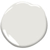
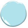
Serenity 2055-60: Blue hues are best for soothing and settling moods, and this one is definitely a breath of fresh air.
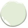
Sleeping Angel 854: Greens are a great choice for the bedroom as they reflect colors found in nature and evoke a feeling of contentment.
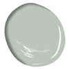
Tranquility AF-490: This versatile blue-grey-green color will pick up its cues from complimentary bedroom fabrics and accessories.
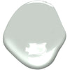
Quiet Moments 1563: Inspiring moments of quiet meditation, this soothing shade creates a look of elegance and simplicity.
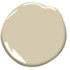
Hush AF-95: It’s easy to imagine the soft whisper of gently drifting sand with this warm neutral in your master suite.
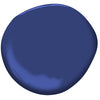
Starry Night Blue 2067-20: Set off this sigh-worthy indigo with contrasting colors, such as equally bold white trim and accents.
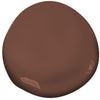
Cocoa Brown 2101-20: Mirroring the dark, delicious shade of cocoa beans, this rich brown creates a comforting setting for curling up with a good book.

Sleepy Hollow 1454: Timeless in its appeal, this dusky purple is perky in daylight, but wraps around you like a favorite duvet at night.
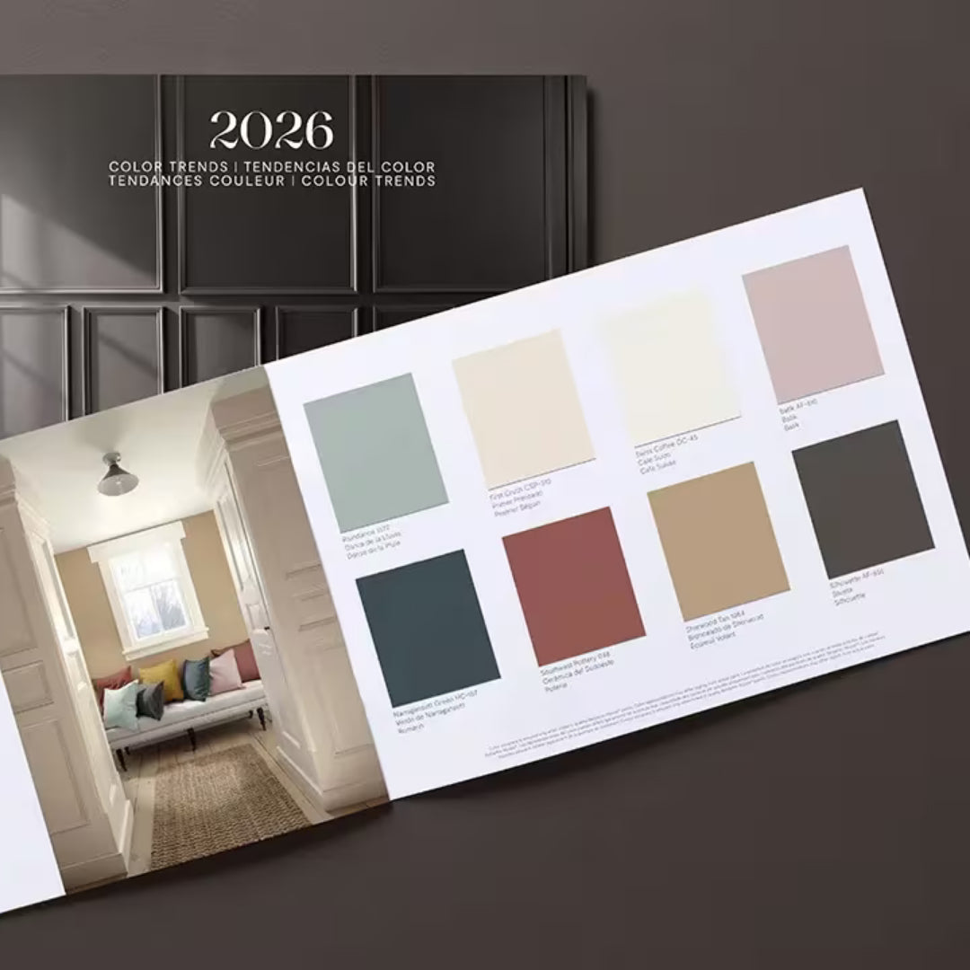
Find fresh color inspiration for 2026 with Benjamin Moore’s new Color of the Year and Color Trends Palette. Silhouette is a study in balance — rich yet restrained, moody yet inviting.
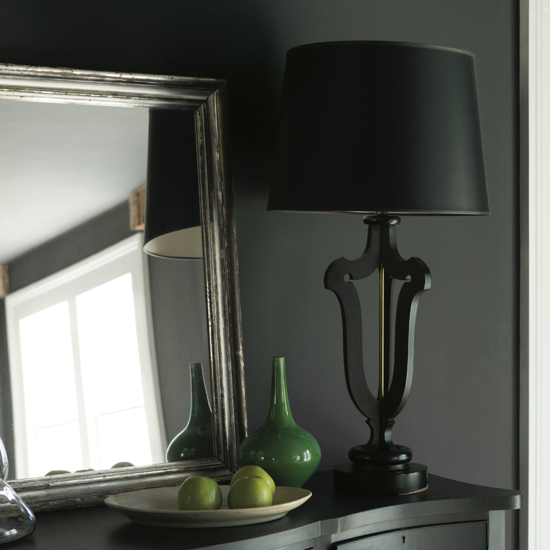
Black paint adds contrast, depth, and timeless elegance to Pennsylvania homes. It pairs beautifully with neutral shades, metallic finishes, and natural textures, allowing homeowners to craft spaces that feel both dramatic and sophisticated.
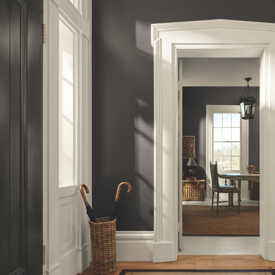
Gray paint colors adapt beautifully to natural light, making them ideal for homes in Easton, Scranton, and Mt. Pocono.