Your Cart is Empty
SAVE TIME, ORDER ONLINE FOR IN-STORE PICK UP
- Shop
- Shop Supplies
- Shop Color
- Window Treatments
- About Us
- For Professionals
- Festool
- Contact Us
- Store Locator
- Gift Cards
- Find a Painter
- Blog
- Login

Whether you’re buying a new home or you are looking to liven up your space, choosing a color scheme for your home can be overwhelming. While every room does not have to be painted the same color, you want a smooth transition from room to room. Use our tips below as inspiration to choose the ideal colors for your home!
Note Which Rooms are Visible to One Another
With open floor plans being more and more popular in today’s home design trends, before you start choosing colors, you need to walk through your house and see which spaces you can see from every room. You’re going to want to make sure that all rooms that can be seen together have a cohesive color plan.
Draw Inspiration from Furniture and Fabrics
If you do not plan on purchasing new furniture, you’re going to need to choose a color scheme that matches the current colors, patterns, and textures found in your pieces. Use accent pieces like rugs and throw pillows to tie in some pops of color that you can use in other rooms of your home.
Start With a Bold Color
If you love color and want to use a bright hue in your home, begin with that space and work around that room in your home. For example, if you want to paint your dining room a deep red, you may want to use softer, more subdued colors for the rooms next to it (like the living room and kitchen). Bold colors can be paired next to each other, but it does carry more risk, so be sure to be cautious when doing so.
Use Neutral Colors in Connecting Spaces
The best way to have your color palette work in your space is to use neutral colors to your advantage. Using shades of white, beige and grey in hallways and foyers can smoothly connect two bold color choices in other rooms of your home. That being said, if neutrals already play a large role in your color scheme, try experimenting with bright pops of color in small, connecting spaces to really make an impact.
Look for Help
If you have no idea where to begin, look online for color palette inspiration. Paint experts like Benjamin Moore release a color of the year along with a complementing color scheme to help you find inspiration for your home. Shadow 2117-30, the 2017 Color of the Year, is a rich, royal amethyst that can fade into a soft lilac-grey or morph into radiant coal.
Use the Color Wheel
The color wheel is a great tool to use to ensure your colors pair nicely together. Complementary colors can be found opposite of one another on the color wheel. While these colors are opposites of each other, they pair perfectly together. Analogous colors can be found next to the initial color you choose. An analogous color scheme can create a rich, monochromatic look. Triad color harmonies can be found by drawing an equilateral triangle on the color wheel. As long as the colors are carefully balanced, using triad colors can create a vibrant color scheme.
For more tips and tricks on how to successfully choose a color scheme for your home, be sure to visit any of our three PA locations. From the moment you enter a Gleco Paint Store, you will be greeted by a paint expert who can help transform the look and feel of your home. For more information, be sure to contact us today.

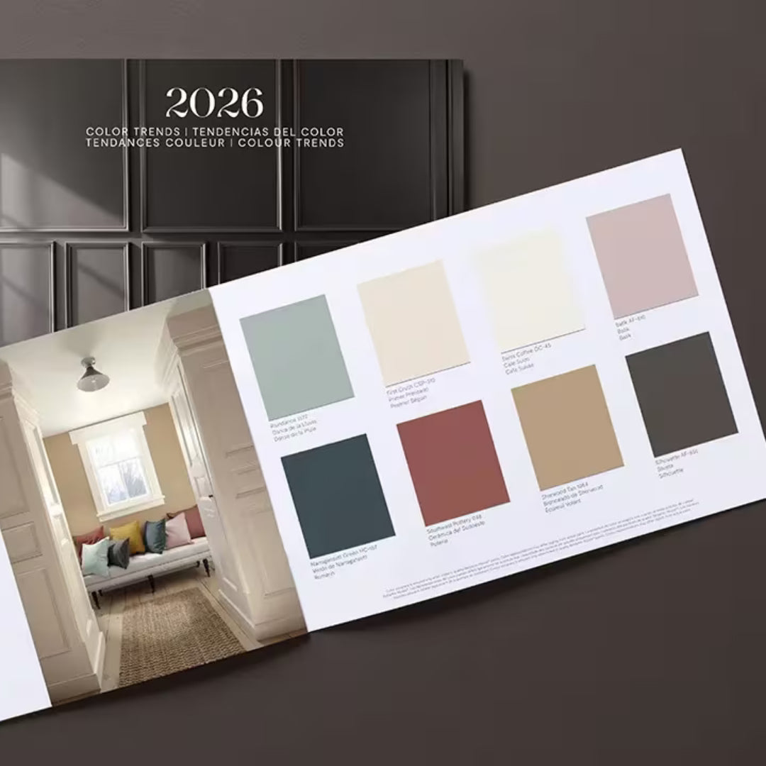
Find fresh color inspiration for 2026 with Benjamin Moore’s new Color of the Year and Color Trends Palette. Silhouette is a study in balance — rich yet restrained, moody yet inviting.

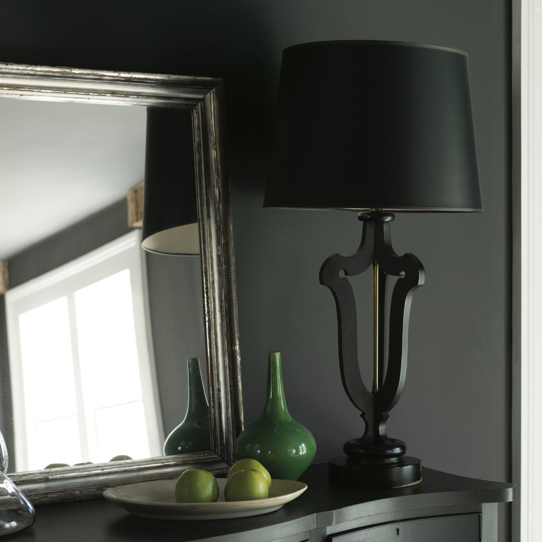
Black paint adds contrast, depth, and timeless elegance to Pennsylvania homes. It pairs beautifully with neutral shades, metallic finishes, and natural textures, allowing homeowners to craft spaces that feel both dramatic and sophisticated.

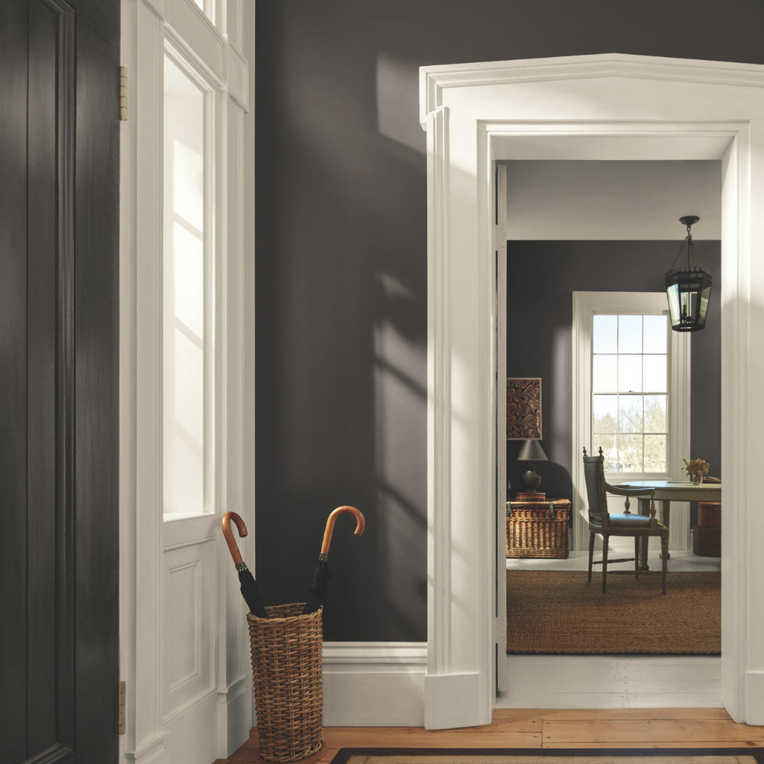
Gray paint colors adapt beautifully to natural light, making them ideal for homes in Easton, Scranton, and Mt. Pocono.