Your Cart is Empty
SAVE TIME, ORDER ONLINE FOR IN-STORE PICK UP
- Shop
- Shop Supplies
- Shop Color
- Window Treatments
- About Us
- For Professionals
- Festool
- Contact Us
- Store Locator
- Gift Cards
- Find a Painter
- Blog
- Login

An interior decorating project can be equally as exciting as it is daunting. While bringing some new life to your living space may be something you’ve been looking forward to, it can be challenging deciding which direction you want to go. The first step is usually one of the most difficult to complete and that is choosing a color scheme that best suits you and the space you want to decorate. With countless colors at your disposal, it can seem impossible to narrow down to just a few, or even one. If there’s one thing that we at Gleco Paint Stores know, it’s color. We’re here to give you advice and guide you throughout your interior decorating journey. Here are some colors we recommend for your next interior decorating project.
Going for bold colors such as deep reds or vibrant blues can be a certain risk that carries reward. When choosing bold colors, it’s a good idea to make that color the centerpiece of the room and decorate around it. For example, if you decide to paint your dining room walls a deep red, it is a good idea to choose your furniture and decorations in a softer and more subtle red tone. Be cautious of pairing bold colors with each other, as they tend to clash and make the room seem too “busy”.
Summer is the season of open windows, fresh air, and sunshine, so why not make your home feel like a nice summer day? If you’re going for a summer feel, bright yellows such as goldenrod or golden ochre are a great choice. Not only will they make the room feel more open, but it will make it feel lighter, cozier, and more welcoming. In fact, it’s been proven that creamy-colored yellows used in the kitchen helped people sell their homes over $1,000 above expected value on average. People love a tasteful, cozy yellow room, so why wouldn’t you?
Earthy tones are typically associated with a more natural feel within a room. Evoking a feelingof relaxation or tranquility, they’re often seen as some of the best choices for any interior decorating project. Usually used in a bedroom, dining room, or living room, they can make you and your guests feel more in tune with nature and escape from fluorescent and unnatural colors. Additional colors such as sage green, dove gray, charcoal brown, and other naturally occurring colors are the best options if you choose to go this route with your interior design project.
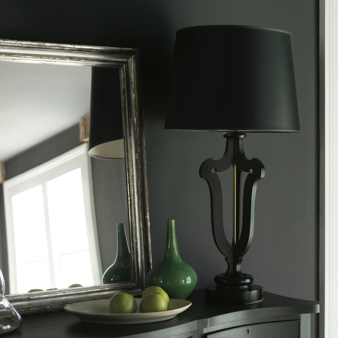
Rooms that center around dark black colors are becoming more and more popular, and for good reason. Using black can offer a dramatic and sleek vibe to a room, especially in an office or living room. However, be careful of overdoing it if you choose to use black. Using too much black in a room can darken it too much and make the room uncomfortable or unappealing. Using it as an accent in carpets, pillows, and other items in a room are the best bet – like pairing it with off-whites and light grays. While it can be a risky gamble, using black in your next interior design project can offer a high reward.
So far, 2018 has been the year of pastels for interior decorating projects. They offer a soft and airy feel to any room especially in kitchens and living spaces. Washed colors such as mint green or light pinks can energize a room, making it feel more relaxing and welcoming. Try accenting with neutral colors to complete the softness to the eye that these colors offer.
Whichever route you decide to take for your interior decorating project, Gleco Paint Stores has everything you need and more. With all of the top name brands in paint, we offer decorating consultations to help you decide on which color is best for your needs. Contact us or visit one of our paint store locations today to get your interior decorating project started on the right foot!

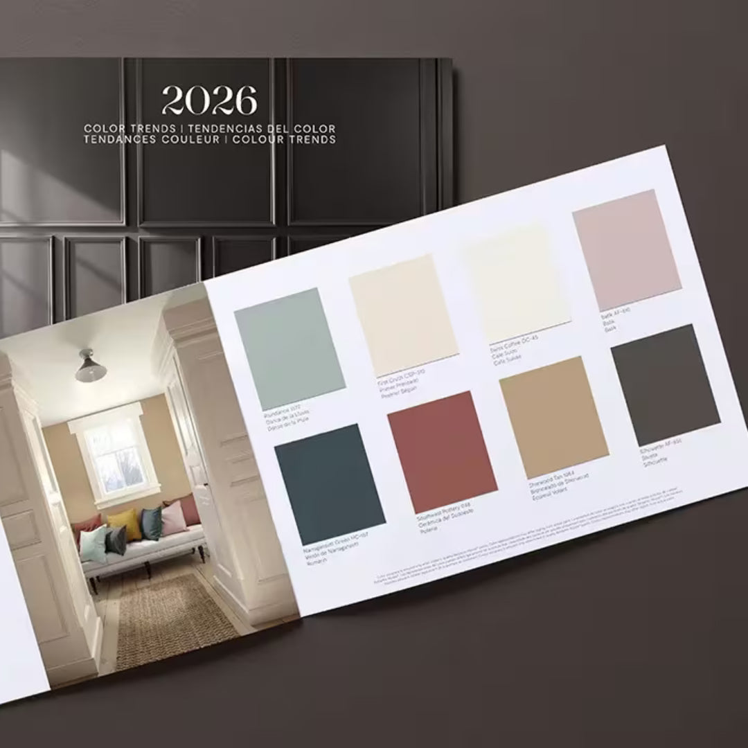
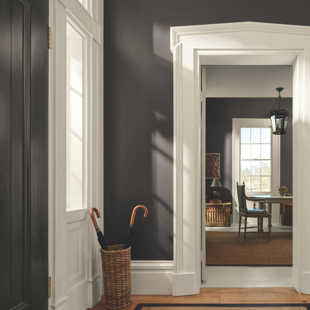
Find fresh color inspiration for 2026 with Benjamin Moore’s new Color of the Year and Color Trends Palette. Silhouette is a study in balance — rich yet restrained, moody yet inviting.

Black paint adds contrast, depth, and timeless elegance to Pennsylvania homes. It pairs beautifully with neutral shades, metallic finishes, and natural textures, allowing homeowners to craft spaces that feel both dramatic and sophisticated.

Gray paint colors adapt beautifully to natural light, making them ideal for homes in Easton, Scranton, and Mt. Pocono.