Your Cart is Empty
SAVE TIME, ORDER ONLINE FOR IN-STORE PICK UP
- Shop
- Shop Supplies
- Shop Color
- Window Treatments
- About Us
- For Professionals
- Festool
- Contact Us
- Store Locator
- Gift Cards
- Find a Painter
- Blog
- Login

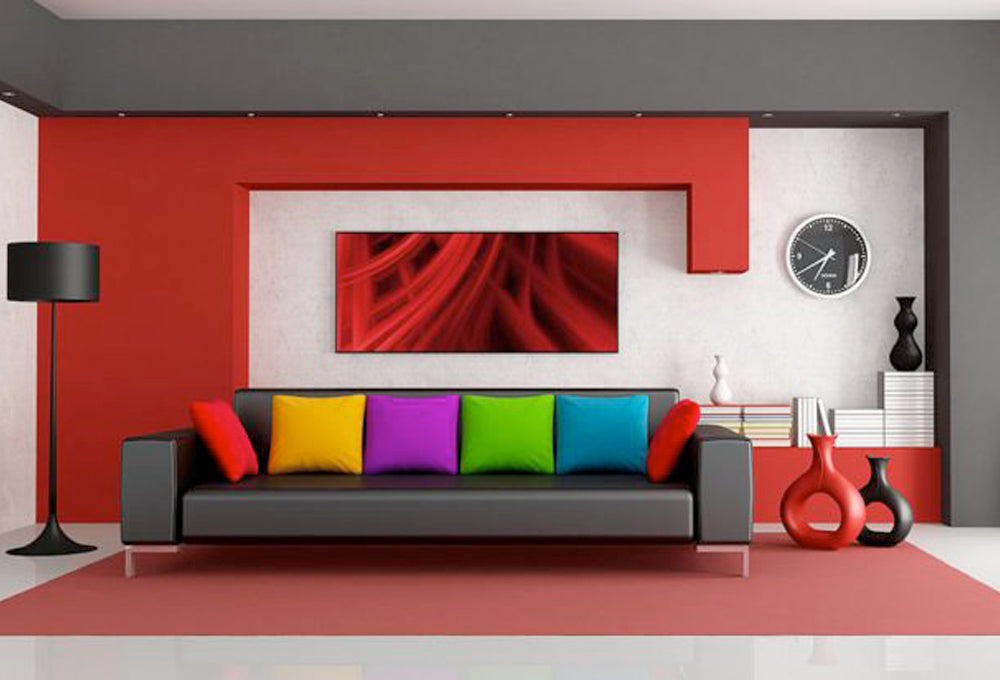
Color is an integral part of any stylish home, and incorporating pops of varying hues into your interior design might matter more than you think. In fact, the benefits of having a colorful home are seemingly endless, as certain paint colors evoke unique feelings to those who view them. Blue, for instance, brings about a calming and relaxing sensation, while red increases the energy level of a room. Regardless of what color you prefer, here are four simple tips for adding color to your space.
Before you confide in a local painting specialist about the type and finish of paint you should purchase, it’s important to draw up a concrete plan regarding the layout of the room, and the exact colors you would like to have inside it. Figuring out which colors complement one another is a large part of this. Check out home magazine spreads, get inspired by a few Pinterest boards and think about which shades will coincide best in your space. Additionally, it’ll be helpful to pinpoint where you’d like to distribute the colors – typically, the walls contain the most, the upholstery has the second most, and the remaining accents in the room have the rest.
Give yourself a small lesson in contrasting to play up the subtle – and not so subtle – color differences in your room. You can choose to go with a high-contrast space, which manipulates both light and dark colors in a set combination, making the room appear more defined. Oppositely, you can opt for a more settling and downplayed low contrast look. Try using a color combination like light yellow and a soft green, which will make for a tranquil room. Not much of a color person? You can also try neutral shades, painting the walls beige or taupe with a white trim – this combination is another soothing one, but is still considered low contrast.
It might sound like an odd tip, but you can certainly turn to the state, town and region you reside for a little inspiration while picking out the color scheme for your space. For example, someone who lives on the west coast might incorporate the sights of the dessert – green, beige, soft yellows – or the serene, picturesque ocean – light blue, lavender and coral. Similarly, you can also pull a few looks from your favorite season. Fall is all about the stunning foliage, so think about the inclusion of burgundy, deep orange and mustard. Spring, on the other hand, may remind you of the cherry blossom trees and colorful, pink tulips, both of which you could easily place on the walls and accents in a room.
As any paint expert knows, customers often feel conflicted while picking out paint for one main reason: They aren’t sure whether or not they will enjoy the option they decide on – especially since they’ll have to look at it every day in their home. And while it might seem at first thought, you can definitely test out a few colors before making the color choice permanent. While you’re shopping around at the store, ask a painting expert for a few paint swatches – the ones you are most serious about pursuing – and take them home to see how they work with your items and in your lighting. Over the next few days, make note of the way those colors look in the morning, afternoon and evening light (both from your lamp and through the window). You can then return to the store to make your final decision!
Adding color to your space can be tiring and tricky, but these tips will definitely make the process so much easier. If you’re living in the Pennsylvania area, consult Gleco Paint for any questions and concerns you might have. Feel free to stop by one of our locations or contact us by calling 570-839-2840.

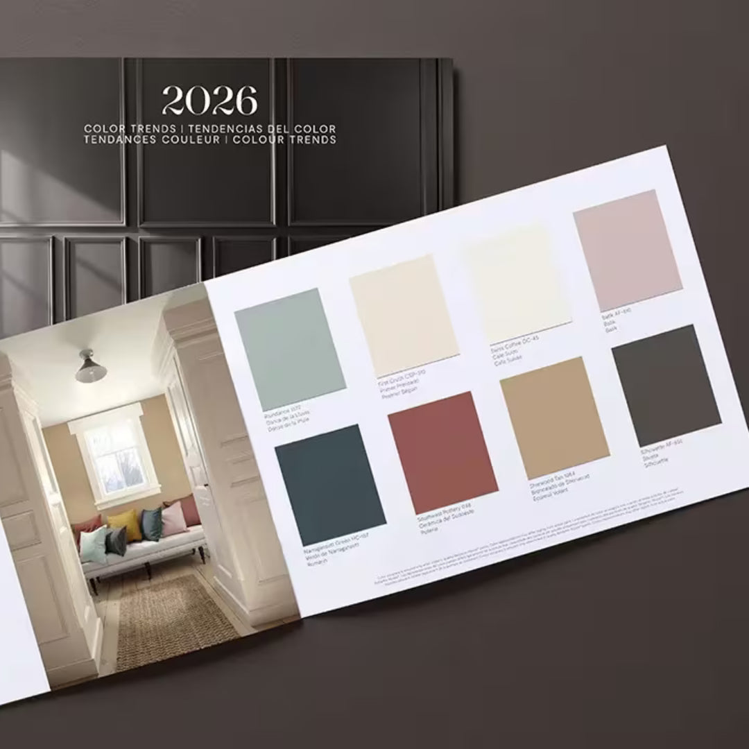
Find fresh color inspiration for 2026 with Benjamin Moore’s new Color of the Year and Color Trends Palette. Silhouette is a study in balance — rich yet restrained, moody yet inviting.

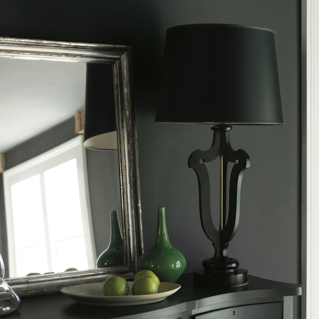
Black paint adds contrast, depth, and timeless elegance to Pennsylvania homes. It pairs beautifully with neutral shades, metallic finishes, and natural textures, allowing homeowners to craft spaces that feel both dramatic and sophisticated.

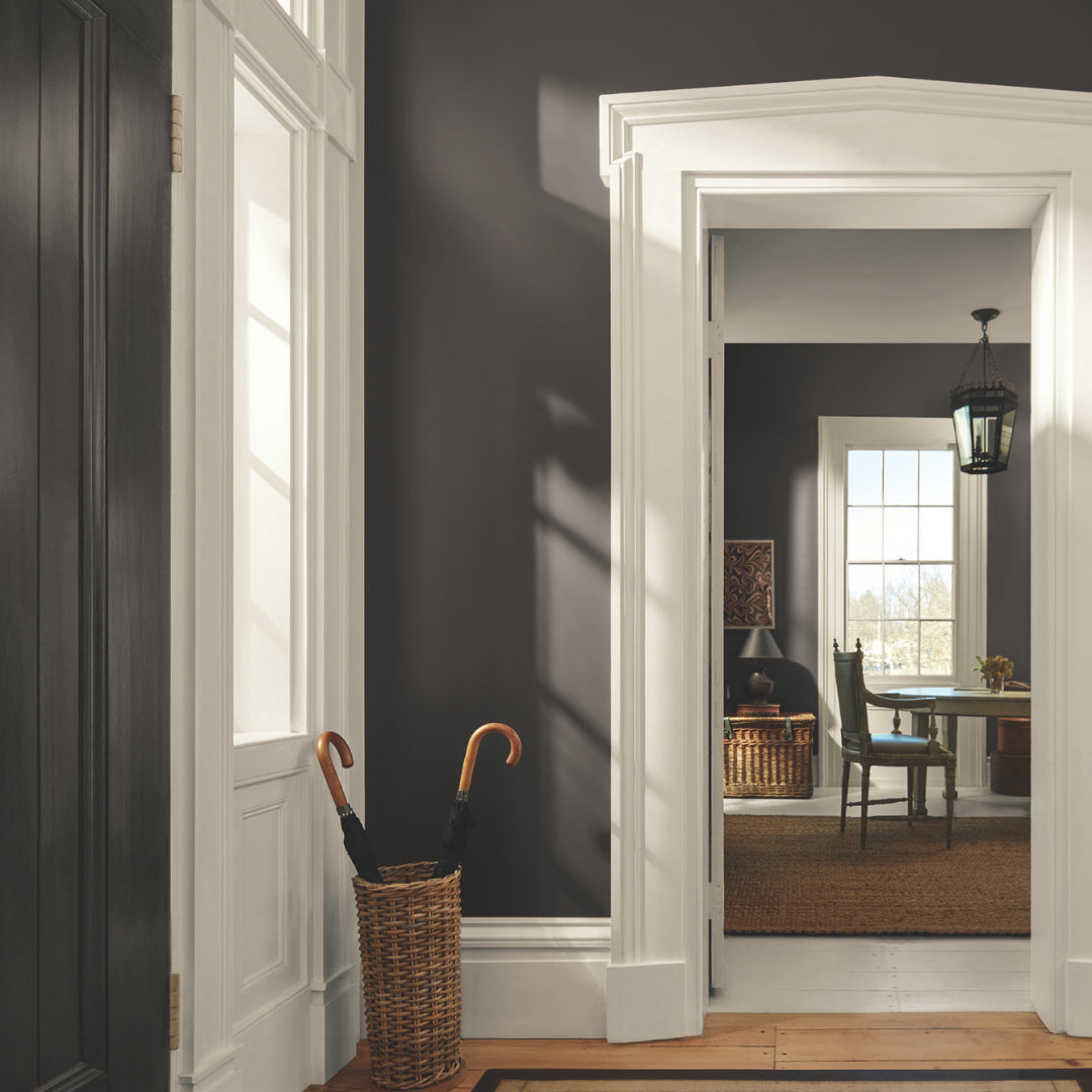
Gray paint colors adapt beautifully to natural light, making them ideal for homes in Easton, Scranton, and Mt. Pocono.